This has been a “quiet” season; foreign visitors have expressed surprise mingled with a relief at how 1966 everything in New York looks. But unless we abandon art for theatre or long-distance phone calls (something called “telephone art” is being mooted in Chicago), anything new will mean a retreat from the ultimate simplicity of Don Judd, who recently showed at the Whitney here. Yet how can this be done without resurrecting the “horrors” of Abstract Expressionism? The Castelli Gallery has been pondering this question. First there was the show of Bruce Nauman, a California “Funk” artist whose work is determined not to look like anything. There were things that dangled, neon tubing, intentionally unfunny jokes, serious platitudes. Then there was Frank Stella’s beautiful show, baroque in comparison to his early austerity and even to the asymmetry of last year. It remained for Jasper Johns and now Ron Davis to elaborate a face-saving way out of the current geometrical bottleneck (this mixed metaphor is offered as an example of critical Funk),
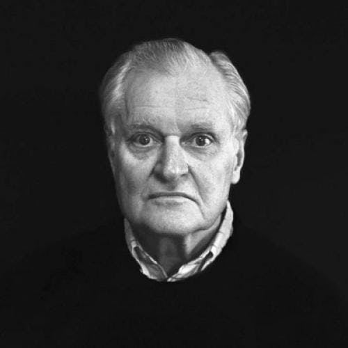
Johns has been a dominant figure for a decade, but has anyone really thought much about him lately? It is always hard to distinguish something really new, especially when its creator is a recognized artist. And Johns has never cared much about pleasing or disconcerting his admirers. He has gone his rather leisurely way, sometimes turning out a bumper crop of flags, to the delight of those who collect them; sometimes (as in his 1966 show and now) producing work whose calculated “no look” was bound to throw off those who were proud of having assimilated the flags.
Johns knows how to buttonhole the viewer. One may puzzle over his pictures, but one does not escape them. What is there to see? Three of them were called Screen Pieces, carelessly daubed over in “Jasper Johns grey,” a color that may be as significant for the 60’s as Lucky Strike green was for the 30’s. Each panel was bisected by a silk-screen reproduction of a string from which spoon and fork hung down, they were grey too and almost impossible to see in the intense grey of the canvas. A vertical message, “Fork should be 7 inches long,” was, I gather, an instruction to the printer which got immortalized in the screening process. The rest of the show consisted of three large horizontal pictures. Harlem Light seemed to have come about because someone had accidentally placed some freshly-painted storm-windows on a piece of canvas. Later Johns had doodled a bit, filling in some of the panes with a dead peach color, daubing in places, resolving to be neat in others, tentatively placing his hand against the fresh paint. The other two pieces were more complicated. More panels, ghosts of window frames, paint-sample rainbows, neatness vs. sloppiness. There was also a new element—panels of mock flagstones suggesting rumpus room linoleum.
One of the few people I spoke to who shared my enthusiasm, a painter, said that Johns reminded him of Anthony Caro. Johns builds away from the edge of the canvas the way Caro builds up from the ground, from something basic and primitive toward something illusory, and in doing so manages to pass through all kinds of being that can happen in painting or sculpture.
John’s show came at a significant moment. I am sure he has no interest in looking for solutions to the present avant-garde slowdown but was just painting away as usual. But it seems likely that the show of Ron Davis at the Castelli was intended as a foretaste of the 70’s. There is a cold messiness to it, but also a lukewarm orderliness. It is not going to be anything you can pin down, at least not for a while—not even Funk.
Davis’ technique, as far as one can tell, is to paint on a sheet of plastic which is then covered with more plastic; the paint, sandwiched in between, has the milky look of painted glass panels in Victorian pier-glasses. The one motif in this show is a shape rather like a ring-mould with the center filled in, and painted with motley stripes so that it suggests a hat in an Uccello. The colors are mostly dull and applied with minor variations in technique.
In 1906 Gertrude Stein wrote apropos of interior decoration in The Making of the Americans:
“…This was all twenty years ago before the passion for the simple line and toned green burlap on the wall and wooden panelling all classic and severe. But the moral force was making then, and now, in art, all for the simple line, though then it had not come to be, as alas now it is, that natural sense for gilding and all kinds of paint and complicated decoration in design all must be suppressed and thrust away, and so take from us the last small hope that something real might spring from crudity and luxury in ornament.”
This “moral force” has been with us at least since the days of Hester Prynne. In the recent climate of painting, a single drip on a canvas has been taken as a sign of white-hot passion and therefore to be expunged at all costs. Painters as austere as Brice Marden and Jules Olitski have been murmured at for leaving an infinitesimal amount of drip or impasto at the edge of their canvases, and a girl I know who is a hard-edge painter but doesn’t particularly think of herself as one, was depressed at being complimented on “the sharpest edges in New York.” It is good to see a brand-new painter like Ron Davis ignoring today’s Manichaeanism to do his “own thing.”
Don Judd’s Whitney show was one of the pleasant surprises of the season. I had remembered the work in his last show as faintly malevolent. Perhaps this was due to the curious atmosphere of the front room at Castelli, a former Edith Wharton-type living room with its windows blocked off, consecrated now to the Future. Maybe, on the other hand, the installation at the Whitney was a little too gorgeous and airy—the fun of emerging into what at first glance suggested a martian Disneyland did not, on further inspection, have much to do with the work itself. But this larger view at least clarified the nature of the work, which is not malevolent at all. What one found was what Judd has called, speaking of Houdon, whom he admires, “that unstressed quality, that absence of any dominant tone.” In an interview with Amy Goldin (Art News, Sept. ’67) he went on to comment interestingly on 19th-century American painting, including Bingham’s Fur Traders Descending the Missouri, whose vast unmodulated surfaces he finds characteristic of American art. Perhaps they are, and perhaps Judd’s enveloping, noncommital surfaces are really American too.
“A work needs only to be interesting,” Judd has said. “Most works finally have one quality.” In Judd’s case it is hard to say what the quality of a particular creation is. Sometimes the work is metal cubes, painted or unpainted, usually with an unexpected detail—irregular spacing, a raised rim, some kind of elementary discrepancy. One of the most beautiful is one of the earliest—a wall of parallel boards painted red, with a concave border of galvanized iron at top and bottom. It would cause no surprise standing in the middle of a Japanese lake, where it would be experienced as a projection of the landscape having no connection with it. There are others which depart from variations on the cube motif, such as an oblong ring that sits on the ground, something like a portable swimming pool, and a low ramp of perforated steel only eight inches high at the tall end of its wedge shape.
Judd’s “A work needs only to be interesting” sums it up. The verdict may not be appealed. My feeling is that Gene Davis’ painting, in a big three-man show at the Jewish Museum, doesn’t succeed. Davis is associated with the Washington color school of Morris Louis and Kenneth Noland. If eight stripes are good in a Morris Louis, surely eighty will therefore be ten times as good? Yet the distance from Louis, not to mention Noland and Ellsworth Kelly (whom Davis suggests in Wall Stripes, a group of several discrete monochrome panels) is immediately apparent and unbreachable. The intended conjugation of color does not take place. Noland’s striped canvases are events; Davis’ are stripes.
Richard Smith, the English painter who won first prize at the last Sao Paolo Biennale, has proceeded from stained shaped canvases with a certain amount of functional clutter to large, irregularly-shaped (or as irregular as you can get with canvas and stretchers) ones in series. There is a Gazebo and you are meant to walk inside it. (The 40’s had the orgone box; we have environmental art.) They are rather casually put together, and apparently it’s OK if they get a little soiled and scruffy. The most successful is a long series of twelve modules painted different colors, each with a kind of truncated corner which lengthens as the series progresses. Perhaps it is meant to suggest a span of days or months with the light or the darkness getting longer. It is in a grand manner which seems more congenial to Smith than the medium-sized manner of the other works.
The most interesting of the three is Robert Irwin, a Californian who paints mysterious pale disks that look like soap bubbles or rather pictures of them on the lid of a soap-bubble set. They are fixed to the end of a rod that projects outward from the wall; spotlights on the floor throw a quadruple shadow of the disk on the wall behind. At first glance the shadows annoyed me; then I grew fond of the way they propel the disk forward, giving it the air of some imperious insect balanced on long legs. What is beautiful is the way Irwin distinguishes between all-but-undistinguishable neutral tones (an earlier oil painting comprised of tiny dots is also remarkable in this way). “Every moment,” wrote Pater, “some tone on the hills or the sea is choicer than the rest.” Irwin seems to have arrived independently at this conclusion after staring straight into a cloud.