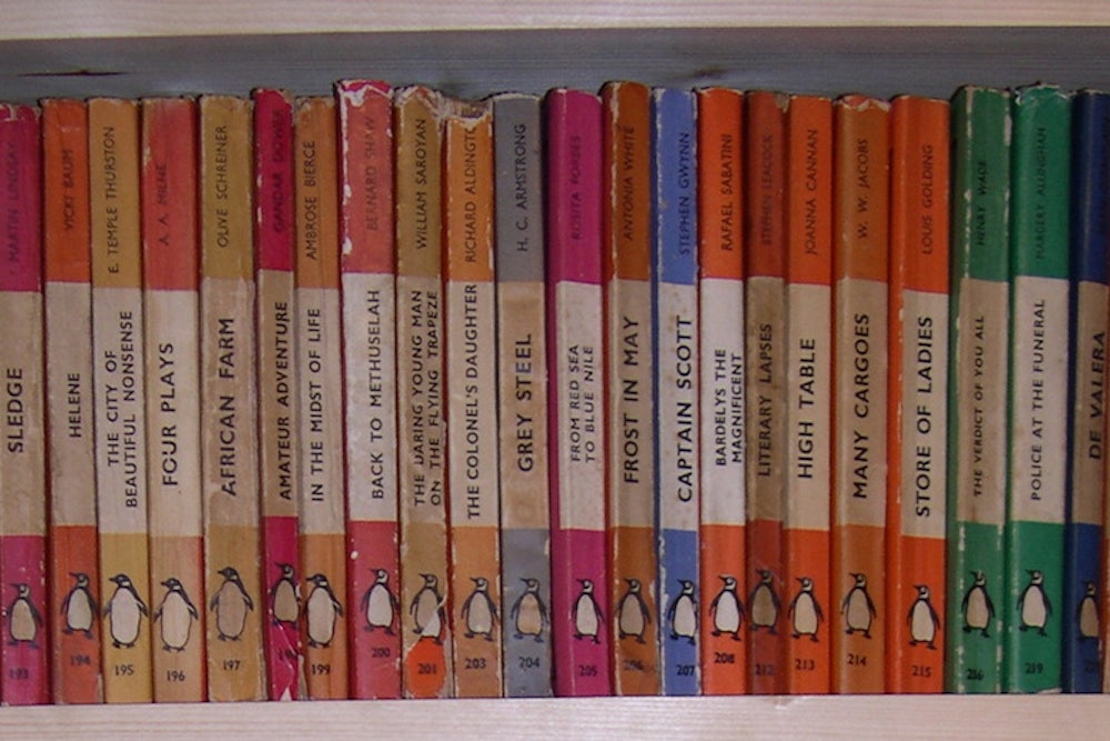
In 2010, the BBC interviewed a Wiltshire man named Steve Hare who'd been collecting Penguin paperbacks so assiduously that he'd amassed over 15,000 titles. In fact, they no longer fit inside his home, and had "overflowed into a garden outhouse." Mr. Hare is not alone in his peculiar obsession. The Penguin Collectors Society boasts over 500 members (which may seem a small group, but remember, this is a club whose sole purpose is to collect one very particular kind of typically low-value book), and a quick search on Pinterest or Flickr will turn up dozens and dozens of bookshelves packed to the brim with those brightly colored spines.
When, on this day in 1935, the very first Penguin paperbacks were released, there were only ten titles, including some authors who are still widely read (Agatha Christie) and others to whom time has not been so kind (Susan Erzt). In the years since as the fabulous book Penguin by Design chronicles, the trim little books evolved from throwaway commodities into aesthetic statements, plastered on everything from commemorative mugs to postcards to two different types of wallpaper.
While the iconic orange stripes and simple sans serif typeface are perhaps the most indelible feature of the Penguin paperback, the examples below prove that with its evolution, Penguin has continued to push the boundaries of what makes a book cover smart, coveted, and collectible.

Hemingway's classic novel was included in the original ten Penguins and features the name of Penguin's original parent company, The Bodley Head. The paperbacks' clean, crisp style sold so well (reportedly more than 3 million copies in the first year), that a year later Penguin struck out as a solo company.

A more recent spin on the original style, the blacked-out text shows the impact of provocative design.

This 1963 version of Harper Lee's classic took promotional marketing to a whole new level, purposely rendering the novel's accolades in amateur-ish crayon and making the text the focal point of the cover. Somehow the (deserved) bragging almost comes off as charming.

It's simple, it's alluring, it's ... Roald Dahl? A pair of sensuously parted lips (with an odd green glow emanating from them) isn't exactly what comes to mind when one imagines the world's most macabre children's writer, but the design is so stark and intriguing that it can't help but capture your attention.

Rather than cluttering up this cover (from Penguin's Great Ideas series) with text, designer Alistair Hall went as streamlined and well, zen, as possible with a simple calligraphed circle. It stands in marked contrast to the often ornate covers of the other Great Ideas books.

Designer David Pelham's work for Penguin was vivid and in-your-face. Rather than creating an aura of mystery for Capote's suspenseful, genre-altering work, Pelham went right for the blood.

The defining cover for Anthony Burgess' trippy masterpiece captures the absurdity and brashness of the novel. That single, gear-shaped eye elevates this cover, as Flavorwire pointed out in this fabulous roundup, to iconic status.

Perhaps the most classically beautiful of all Penguin's paperbacks, Stephen Russ's work for the Penguin Poets series matched occasionally chaotic prints with poets. Stacks of Penguin Poets books are among the most pinned images on Pinterest.

As the first publishers of the complete, uncensored version of D.H. Lawrence's novel, Penguin fought the Obscene Publications Act in 1960—and won. The cover design (again by Stephen Russ) of a rising phoenix is particularly apt.
